Why Data Cinematography?
The world today is abundant with data, so much so that it can be overwhelming. We carry gigabytes in our pockets, in supercomputers with display densities rivaling movie theaters.
Yet, when it comes to understanding and explaining data, we are often starved. Nowhere is this dearth more evident than in everyday presentations. We squander this vast computing potential by depending on a medium designed in the 1980s as a digital retrofit of the mid-century invention of the "slide."
The dissonance is so severe that most presentation guidelines discourage displaying data at all, suggesting instead to "leave the tables to the handouts." In the TikTok era of shrinking attention spans, presenters of serious information will likely find it even harder to engage audiences, whether in person, online, or in pre-recorded formats.
There have been notable exceptions to this trend: the foundational work of Edward Tufte and Hans Rosling. As our cave-painting ancestors understood, visual representation of data is often the key to world-changing communication. Historical examples—Galileo's moon drawings, Minard's statistical maps, Snow's cholera studies—were catalogued and popularized by Tufte in the 1990s. Rosling brought another dimension in early 2000s: motion. By animating data programmatically, he turned lifeless statistics into memorable TED talks that influenced millions.
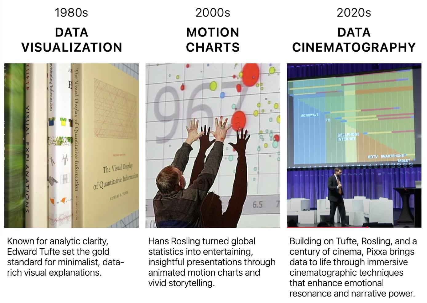
It was in Rosling's footsteps that we began our decade-long journey. Inspired by the blank slate of the iPad and its expressive multi-touch interface, we saw a path to a new medium for motion data visualization: motion charts for everyday presentations of data.
As we pushed beyond discrete Rosling-style animations, we found ourselves moving away from theatrical performances, where the screen serves as a stage for an animating presenter, toward cinematic ones where the presenter is directing the audience's eyes to animating characters on the screen. It dawned on us that we were bringing cinema to graphs…cinematograph!
What if we applied filmmaking techniques of framing, pacing, reveals, focus, lighting, motion, texture to direct the eye, evoke emotion, and explain complex phenomena? Could we eliminate bullet points entirely? Could we cast data categories as "characters" with story arcs? The answer was a resounding yes! This is what we have been doing for the past decade. Some have called "Post-PowerPoint storytelling."
Audience of Data Cinematography
Our audience is broad: business professionals, educators, scientists, and designers who need to communicate complex data with clarity and impact. It will be equally valuable in boardrooms, classrooms, research conferences, online courses, and public media. The goal is to equip readers with the fundamentals as well as the practical aspects of motion data storytelling, to have them see their presentations with the so-called director's eye, so that they can exploit today's abundant data to connect with their audiences through dynamic, emotionally resonant motion visuals. We will also look ahead to how these techniques extend beyond screens into spatial computing and generative artificial intelligence.
Like to learn more about Data Cinematography? Send us your questions!
We're always interested in hearing from people who want to learn more about Data Cinematography. Whether you're curious about the techniques, have questions about implementation, or want to discuss how it might apply to your work, we'd love to hear from you. Send us your questions and we'll do our best to answer them in future posts or directly.